Veqra

CONCEPT / 2025

Veqra homepage on desktop and mobile: the headline “Your entire portfolio. One dashboard.”, a blue Get Started button and a portfolio dashboard, on a cool grey background.

SCOPE

web design

framer development

motion design

branding

SCOPE

web design

framer development

motion design

branding

INDUSTRIES

fintech

HIGHLIGHT

the site grid exposed in the footer, lit up on hover

03

/ 04

Veqra homepage on desktop and mobile: the headline “Your entire portfolio. One dashboard.”, a blue Get Started button and a portfolio dashboard, on a cool grey background.

ABOUT

Veqra is a concept for portfolio analytics aimed at private investors: brokerages synced into one dashboard, risk scores, rebalancing alerts. The brief sold it as AI-powered, so the design job was making dense numbers read calmly, not pretending to build the intelligence. Marketing site, dashboard showcase, CMS blog and a physics-based 404, two weeks in Framer. The metrics on the site are invented.

ABOUT

Veqra is a concept for portfolio analytics aimed at private investors: brokerages synced into one dashboard, risk scores, rebalancing alerts. The brief sold it as AI-powered, so the design job was making dense numbers read calmly, not pretending to build the intelligence. Marketing site, dashboard showcase, CMS blog and a physics-based 404, two weeks in Framer. The metrics on the site are invented.

CHALLENGES

The footer usually gets whatever is left over. Here it became the last statement on the page: the grid that structures the whole site, invisible everywhere else, exposed as thin column lines behind an oversized wordmark. It was not in the plan. It came out while I was building the page, and it is the part I would keep if I could keep one thing.

One rule decided the rest: blue appears only where something is interactive. Static numbers stay black, the grid columns light up under the cursor, and the mobile version drops the effect instead of faking it. The dashboard is a static screen on purpose, because a fake live product would be the one lie a portfolio piece cannot carry.

CHALLENGES

The footer usually gets whatever is left over. Here it became the last statement on the page: the grid that structures the whole site, invisible everywhere else, exposed as thin column lines behind an oversized wordmark. It was not in the plan. It came out while I was building the page, and it is the part I would keep if I could keep one thing.

One rule decided the rest: blue appears only where something is interactive. Static numbers stay black, the grid columns light up under the cursor, and the mobile version drops the effect instead of faking it. The dashboard is a static screen on purpose, because a fake live product would be the one lie a portfolio piece cannot carry.

Veqra dashboard page on a cool grey background: the headline “Clarity for every part of your portfolio.” above a dashboard with portfolio value, 24h change, risk score and holdings cards.

dashboard showcase

Close-up of the Veqra footer: the outlined wordmark over thin vertical grid lines on dark navy.

exposed grid footer

Veqra footer grid under the cursor: a few vertical grid lines turn blue next to the outlined wordmark, with a :hover tag and the pointer shown.

grid hover state

Three full Veqra pages side by side on a cool grey background: the homepage, the dashboard showcase and the Latest Insights blog.

home, dashboard and blog pages

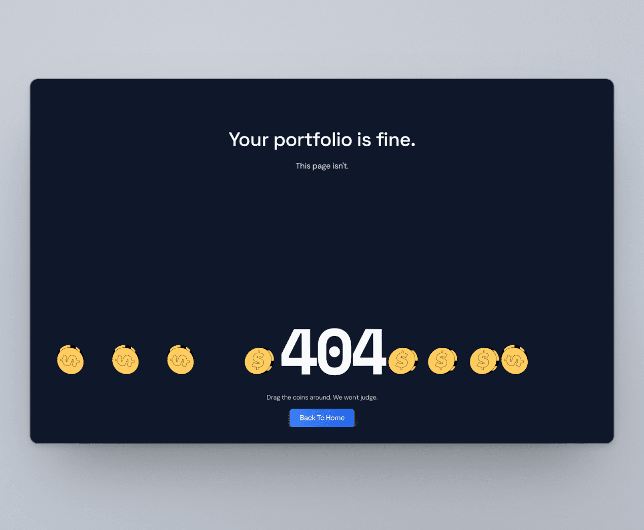
Veqra 404 page on a cool grey background: “Your portfolio is fine. This page isn't.” with gold coins resting around a large 404 and a Back To Home button.

physics-based 404

Veqra palette as stacked bands sized by use: navy #0F172A background, slate #1E293B cards, line #334155 grid columns, frost #F8FAFC type and static numbers, and a thin band of blue #3B82F6 for interactive elements only.

palette, blue only where it clicks

Four Veqra mobile screens in phone frames on a cool grey background: the hero with the dashboard preview, the features, the key figures, and the footer with a newsletter signup.

mobile views

Veqra dashboard page on a cool grey background: the headline “Clarity for every part of your portfolio.” above a dashboard with portfolio value, 24h change, risk score and holdings cards.

dashboard showcase

Close-up of the Veqra footer: the outlined wordmark over thin vertical grid lines on dark navy.

exposed grid footer

Veqra footer grid under the cursor: a few vertical grid lines turn blue next to the outlined wordmark, with a :hover tag and the pointer shown.

grid hover state

Three full Veqra pages side by side on a cool grey background: the homepage, the dashboard showcase and the Latest Insights blog.

home, dashboard and blog pages

Veqra 404 page on a cool grey background: “Your portfolio is fine. This page isn't.” with gold coins resting around a large 404 and a Back To Home button.

physics-based 404

Veqra palette as stacked bands sized by use: navy #0F172A background, slate #1E293B cards, line #334155 grid columns, frost #F8FAFC type and static numbers, and a thin band of blue #3B82F6 for interactive elements only.

palette, blue only where it clicks

Four Veqra mobile screens in phone frames on a cool grey background: the hero with the dashboard preview, the features, the key figures, and the footer with a newsletter signup.

mobile views